Nothing kills the hype of a new $70 purchase faster than being trapped in a digital preschool for forty-five minutes. We’ve all been there, staring at a screen that refuses to let us move until we’ve rotated the camera three times like a well-trained dog. These tedious tutorial levels aren’t just a waste of time. They’re a fundamental failure in game design that treats the player like they’ve never seen a controller before.
The death of the physical manual shouldn’t mean we’re forced to endure a glorified slideshow while a floating NPC explains how to jump. If a game is actually well-designed, I shouldn’t need a locked room and a pop-up window to figure out that the A button makes my character leave the ground. We’re here to play the game, not to be lectured on the concept of walking forward.
Key Takeaways
- Mandatory tutorial levels and intrusive pop-up windows are fundamental design failures that break immersion and treat seasoned players with condescension.
- Effective game design teaches mechanics organically through level geometry and environmental cues rather than freezing the action for text-heavy instructions.
- Artificial progression gates, such as locking basic mobility skills like jumping or crouching behind tutorials, stifle momentum and frustrate players.
- Developers must trust the audience’s intuition and prioritize immediate engagement over tedious, unskippable drills that treat gameplay like a mandatory training seminar.
The Curse Of Mandatory Movement Drills
There is nothing quite as soul-crushing as booting up a high-octane action game only to be treated like a toddler who just discovered they have limbs. We have all been there, sitting through the mandatory tutorial levels where the game refuses to let us play until we look at a flickering light bulb or walk three feet toward a door. It is an insulting waste of time that assumes the player has never seen a piece of plastic with buttons on it before. These drills do not teach us how to play. They simply teach us how to resent the developers before the first cutscene even ends. If your game requires me to prove I can move the camera up and down to calibrate my eyes, you have already failed the first impression test.
The core of the problem is that these hand-holding exercises treat seasoned gamers like an inconvenience rather than an audience. Instead of weaving mechanics into a compelling opening sequence, lazy design relies on these static, immersion-breaking checklists that grind the momentum to a halt. It is the digital equivalent of a flight attendant explaining how a seatbelt works to a group of frequent flyers, except you cannot ignore it by putting on headphones. When the pacing is sacrificed for the sake of explaining that the left stick moves your character, most of us are already hovering our thumbs over the uninstall button. We want to experience the world you built, not spend ten minutes proving we possess basic motor skills.
Great games understand that the best tutorials are the ones we do not actually notice while we are playing them. They trust the player to experiment and learn through action rather than forcing us into a virtual playpen for a series of condescending chores. There is a special kind of fury reserved for being locked in a room until you press the jump button three times on command. This brand of design is a relic of a bygone era that needs to be buried alongside printed manuals and wired controllers. If you cannot trust me to walk through a doorway without a prompt, I probably cannot trust you to deliver a gameplay experience that is actually worth my time.
Pop-Up Windows And The Death Of Immersion

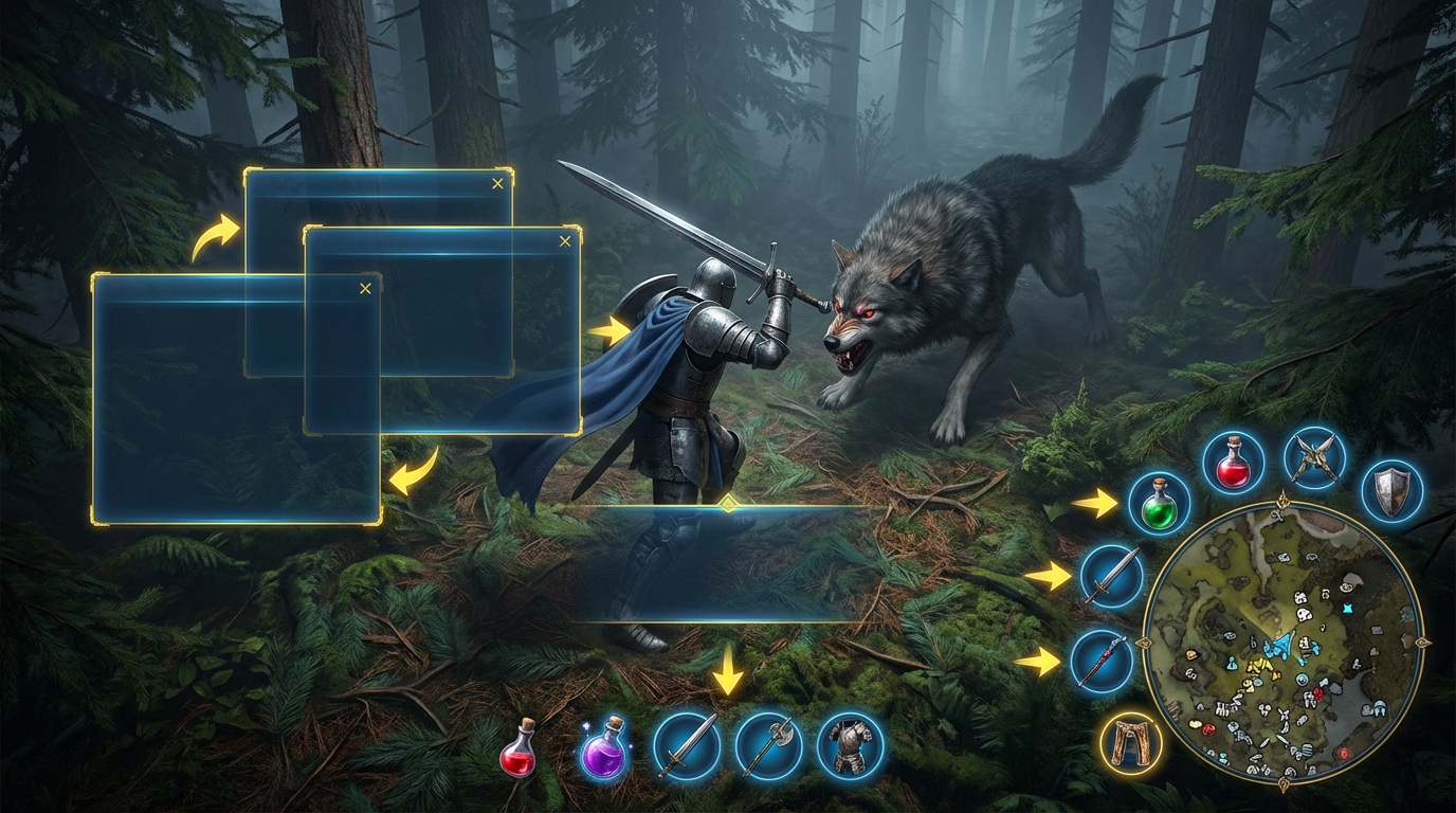
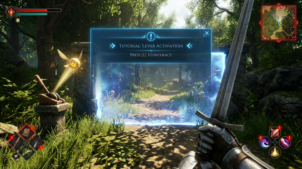
There is nothing quite like the thrill of booting up a highly anticipated new release only to be immediately greeted by a gray translucent box that freezes time itself. You want to swing your sword or explore the horizon, but the game insists on lecturing you about the jump button as if you have never touched a controller in your life. Modern developers seem to have forgotten that we learn by doing, not by reading corporate-flavored instruction manuals one pop-up window at a time. Every time the action grinds to a halt for a tooltip, the carefully crafted atmosphere of the world shatters into a million pieces. It is the digital equivalent of a waiter stopping you mid-bite to explain the physics of a fork.
This trend of intrusive hand-holding has effectively murdered the philosophy of show, don’t tell in favor of lazy, interruptive UI design. Instead of placing a ledge in front of us and letting our natural curiosity take over, games now feel the need to pause the universe to explain that the X button corresponds to vertical movement. These tutorials treat players like toddlers with short-term memory issues rather than capable adults who can recognize a glowing objective marker. We are forced to endure a stop-and-go experience that feels more like a mandatory HR training seminar than a piece of entertainment. If your game mechanics are so convoluted that they require a constant stream of pop-up interruptions, the problem is not the player’s intelligence, it is your design.
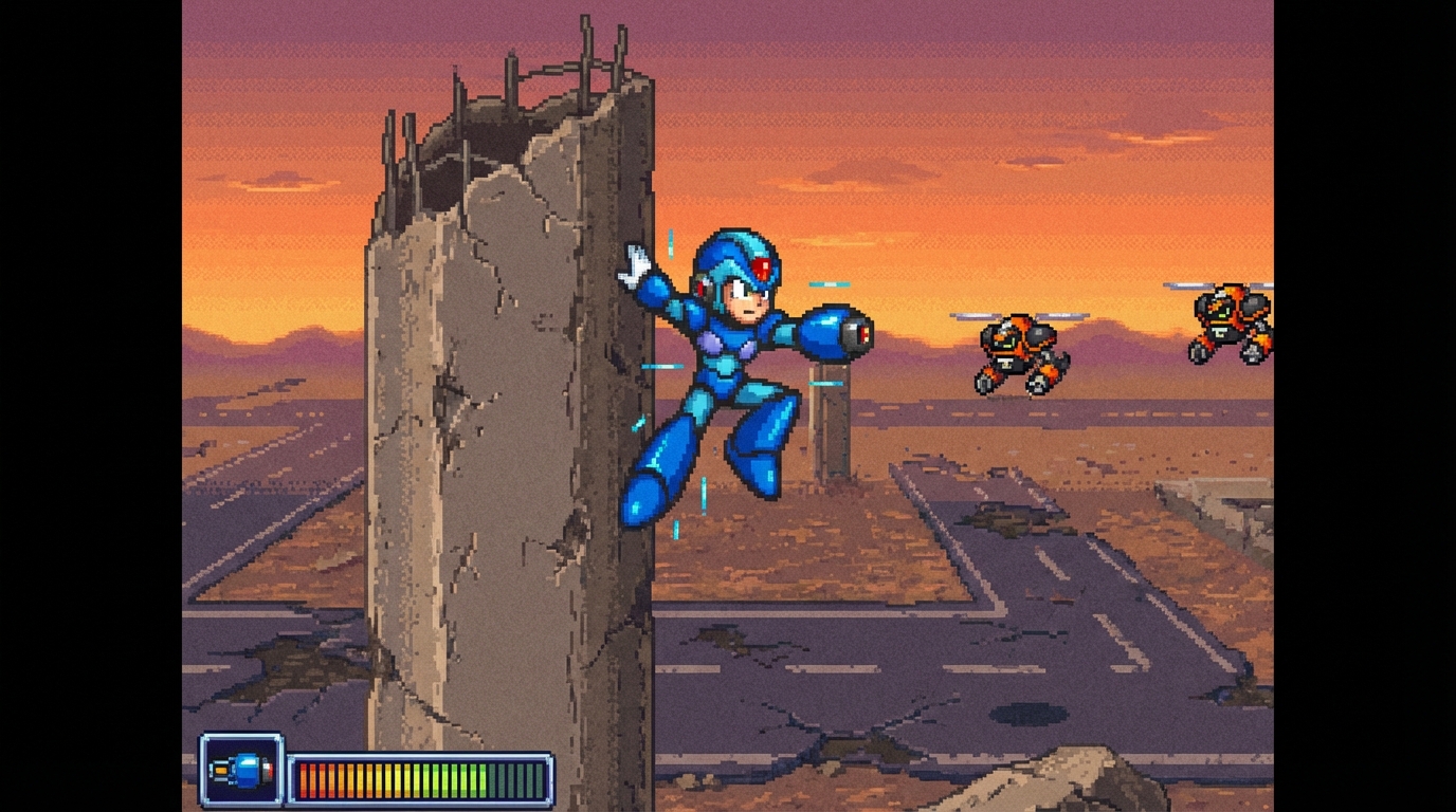
The most frustrating part is that we have seen this done better decades ago without a single line of intrusive text. Classic titles used level geometry and subtle visual cues to teach mechanics organically while we were actually moving and interacting with the world. Now, we get a frozen screen and a paragraph of dry text that explains a mechanic we already figured out three minutes ago by accident. This friction creates a massive barrier to entry that makes starting a new game feel like a chore rather than an adventure. It is time for developers to trust their audience again and stop letting UI designers play the role of an overbearing helicopter parent.
Locked Mechanics And Artificial Progression Gates
There is nothing quite as insulting as a game that treats you like you have never held a controller before. We have all been there, staring at a character who looks like a legendary warrior but moves like they are stuck in waist deep molasses because the introduction phase is still active. You know for a fact that your character has a double jump, yet the game refuses to let us use it until you have sat through a three minute lecture on gravity. It is a special kind of developer arrogance to assume that players cannot handle a basic inventory screen without a guided tour. These artificial progression gates do not teach us how to play. They just prevent us from actually having any fun.
Developers seem to think that slowly drip feeding us basic mobility options creates a sense of progression, but it really just highlights lazy design. If your game is only interesting because you took away my ability to run or dodge, then your core gameplay loop is probably in serious trouble. I have spent twenty years jumping over bottomless pits, so I really do not need a pop up window to explain that the A button makes me go upwards. It feels like being forced to take a driving test every single time you buy a new car just to prove you know where the brake pedal is. This hand holding turns what should be an exciting opening into a chore that makes me want to quit before the first boss even appears.
The worst offenders are the games that nerf your existing skills just so they can sell them back to you as upgrades four missions later. You start the prologue with a full arsenal of cool moves, only to have a cutscene strip them away so the tutorial can feel relevant for another hour. It is a cheap trick that creates a massive disconnect between the narrative and the actual experience of playing the game. Instead of building a challenge that respects my intelligence, the studio chooses to gatekeep the fun behind a series of redundant checklists. If I have to unlock the ability to crouch in a stealth game, I am not feeling a sense of growth. I am just wondering why I bought the game in the first place.
Better Ways To Teach Without The Boredom

The era of the mandatory three-hour training camp needs to end before I lose my mind and my interest. We have all been there, trapped in a digital playpen where a floating icon forces us to press the jump button five times like we are performing for treats. It is an insulting waste of time that treats the player like they have never seen a controller before in their life. Developers seem to forget that the best way to learn a mechanic is to actually use it in a high-stakes situation rather than reading a pop-up book. If your game requires a thirty-minute lecture on how to move the camera, you have already failed the first impression test.
Legendary titles like Half-Life and Ocarina of Time proved decades ago that you can teach complex systems without ever breaking the fourth wall. These games respect your intelligence by placing obstacles in your path that naturally require the specific skill they want you to master. You learn to crouch-jump because there is a vent in your way, not because a UI prompt froze the screen to give you a PowerPoint presentation. This organic approach keeps the momentum alive and allows the player to feel like a genius for solving a problem. It turns the act of learning into an actual part of the adventure instead of a chore you have to finish before the fun starts.
Stop treating us like toddlers and start designing levels that speak for themselves through clever environmental cues. A well-placed light or a subtle enemy movement can teach a player more about game logic than a thousand lines of dialogue ever could. When a developer trusts the player to experiment and fail, the eventual success feels earned rather than gifted. We are here to play a game, not to be lectured on basic physics and button layouts. Give us the tools, show us the target, and then get out of the way so we can actually start the experience we paid for.
Stop Treating Us Like Gaming Toddlers
A game that treats you like you have never seen a controller before is a fundamental failure in design that does not respect your time. We have been jumping over pits and managing inventory slots for decades, yet developers still insist on locking us in a virtual classroom for the first hour of every major release. If I have to sit through another unskippable pop-up window explaining that the left stick moves my character, I might actually lose my mind. It is time for studios to cut the umbilical cord and trust that players have enough basic intuition to figure out a double jump on their own.
The harsh reality is that if a game feels like a mandatory HR seminar in its opening act, it rarely gets better once the training wheels come off. First impressions are everything in this industry, and starting your epic adventure with twenty minutes of follow the NPC chores is the fastest way to earn a spot in my uninstalled library. I am not here to be lectured on the intricacies of a light attack by a patronizing tutorial ghost. Life is too short to play games that are afraid to let you fail, especially when bloated open worlds and 100-hour playtimes are already turning modern gaming into a tedious second job. If the first hour is a slog, do yourself a favor and go play something that actually wants you to have fun.


