
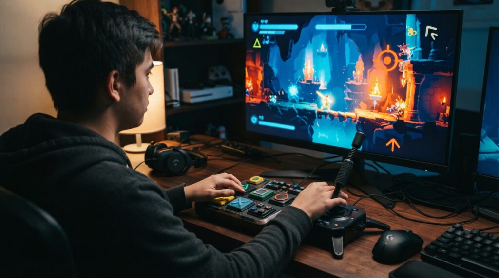
Game accessibility options are not bonus switches for a mythical “other” player. They can mean the difference between enjoying a game and fighting the settings menu harder than the final boss. I want adjustable controls, readable text, subtitles that identify who is speaking, and difficulty options that respect my time instead of treating it like a personal insult. When developers get this right, more people can play, finish, and enjoy their games without needing a PhD in workaround technology.
The best options cover visual, auditory, motor, cognitive, communication, and photosensitivity needs while making the game easier to understand and control. The worst ones slap on a colorblind filter, call it innovation, and clock out early. Knowing what to look for before buying can save money, frustration, and several deeply undignified encounters with a tutorial boss.
Key Takeaways
- Game accessibility is essential design, not an optional bonus: effective features address visual, auditory, motor, cognitive, communication, and photosensitivity needs so more players can understand, control, and enjoy the game.
- Prioritize practical options such as readable customizable subtitles, speaker and sound-effect captions, high contrast and non-color visual cues, separate audio sliders, full control remapping, hold-or-toggle inputs, one-handed layouts, and alternative input support.
- Flexible difficulty and cognitive tools—including aim assistance, damage adjustments, slower game speed, generous timing windows, navigation aids, puzzle hints, and reduced visual clutter—should let players tailor challenges without removing their control.
- Before buying, verify specific accessibility details through store pages, demos, developer documentation, and patch notes; confirm what can be changed, when it can be changed, whether options work throughout the game, and whether they can be tested beforehand.
Visual And Audio Accessibility Settings
Good subtitle options do more than slap white text at the bottom of the screen and call it accessibility. I look for adjustable size, font, background opacity, speaker labels, and captions that identify important sounds instead of vaguely announcing “noise.” Labels matter when every character sounds like they were recorded in the same broom closet. Captions for footsteps, alarms, and off-screen attacks can turn confusion into useful information. If the only customization is “small” or “large,” the setting feels like it was added five minutes before launch by someone who had already packed their desk.
Visual settings should make information clearer, not turn the game into a neon emergency broadcast. High-contrast modes, colorblind filters, screen magnification, and distinct visual cues can help me read menus, spot enemies, follow objectives, and understand status effects without relying on color alone. The best games pair color with icons, patterns, outlines, or shapes, because “just use red and green” is not a design philosophy. A filter that washes the entire screen in radioactive orange while leaving critical symbols indistinguishable is not accessibility. It is a threat.
Audio sliders are equally important, especially when music is louder than dialogue and sound effects are competing for the same tiny corner of the mix. Separate controls for dialogue, effects, music, ambience, and voice chat let me build a mix I can actually understand. Visual indicators for attacks, objectives, and nearby hazards provide a useful backup. I also check whether the game remembers these settings, applies them consistently during cutscenes, and explains what each option changes. That practical consistency separates genuine accessibility from a menu full of impressive-sounding toggles that collapse the moment the game gets busy.
Remappable Controls And Input Assistance
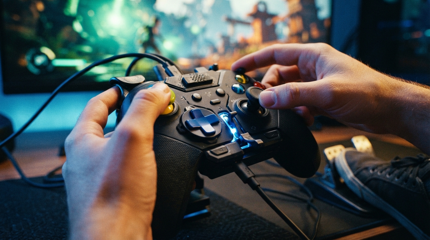
Full button remapping is the baseline, not a luxury feature deserving a parade. I want to move every action, including stick clicks, triggers, face buttons, and awkwardly buried menu commands, because “three preset layouts” is not customization. It is rearranging the furniture. Hold-versus-toggle options matter just as much, especially for sprinting, crouching, aiming, and button presses that punish anyone with limited dexterity. One-handed layouts and reduced button-mashing can turn a physically exhausting sequence into something genuinely playable instead of a thumb endurance test disguised as gameplay.
Good input assistance should reduce strain without taking control away from me. Adjustable stick sensitivity, dead zones, aim acceleration, and gyro aiming can provide fine control for players who prefer motion input, but it should be optional, adjustable, and easy to disable when waving a controller at the television starts feeling like unpaid exercise. The best games also support adaptive controllers, keyboard and mouse, switches, remapping software, and other alternative devices without treating them like mysterious alien technology.
I judge these options by whether they solve a real problem in actual play, not by how impressive the settings menu looks. A toggle that works everywhere is useful. A “hold or press” choice that mysteriously disappears during a minigame is accessibility theater with a menu icon. Developers should explain what each setting changes, test it across combat, menus, quick-time events, and movement, then let players combine options freely. If the result gives me meaningful control over timing, precision, and effort, it belongs in the game. If it offers three nearly identical presets and calls the job finished, it belongs in the uninstall queue.
Difficulty Timing And Cognitive Tools
Difficulty settings should let me tune a game instead of forcing me to pass an exam designed by a sleep-deprived sadist. Lower enemy health, reduced damage, invincibility, slower game speed, and more generous parry windows can make combat manageable without turning it into a screensaver. These tools help players with motor, cognitive, or reaction-time needs stay engaged with the same worlds, stories, and mechanics everyone else is enjoying. If I want to spend less time being flattened by a boss and more time appreciating its design, that is customization, not cheating.
Cognitive accessibility matters just as much when the problem is figuring out where to go or what the game is asking me to do. Navigation aids, clear objective tracking, puzzle hints, and optional assistance can cut through needless confusion, especially when a quest marker vanishes into a forest because apparently maps are now a luxury. Reduced visual clutter can also make busy scenes easier to read by toning down screen shake, flashing effects, background noise, or excessive interface elements. Good options remove barriers while leaving me in control of how much help to use.
The best accessibility menus treat these features as practical tools, not apologies hidden in a dusty corner of the settings screen. I can combine a slower game speed with stronger navigation, or keep full damage while extending a parry window, depending on what makes a particular game playable for me. That flexibility matters because accessibility needs are not one-size-fits-all, and “easy mode” is a spectacularly lazy way to describe them. A game should challenge my decisions and imagination, not my ability to endure preventable frustration.
Accessibility Labels Before You Buy
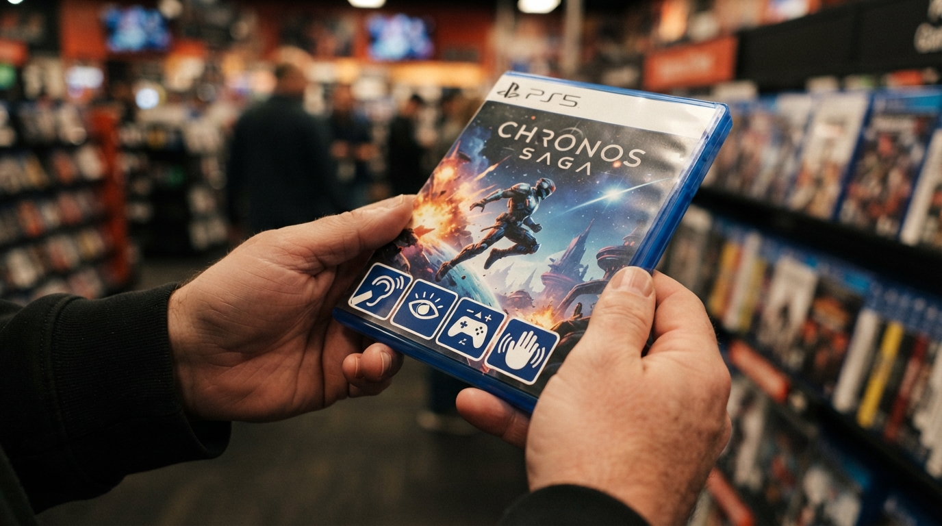
I check a game’s store page before I check its trailer, because explosions rarely explain whether subtitles can be resized. I look for specific details about subtitle size, speaker labels, background opacity, colorblind settings, high-contrast modes, remappable controls, hold or toggle inputs, and difficulty tools such as aim assistance or damage adjustments. “Accessible gameplay” is not a feature. It is a fog machine wearing a lanyard. A useful listing tells me what I can change, where I can change it, and whether the option applies throughout the game. If the page only promises “immersive experiences for everyone,” I assume the marketing department has played more of it than I have.
Demos are especially valuable because they let me test the settings that store pages describe with all the precision of a fortune cookie. I use them to check whether subtitles stay readable during busy scenes, color adjustments actually separate important objects, controls can be remapped without losing essential actions, and difficulty tools work outside the opening tutorial. Developer documentation and patch notes can fill in the gaps, particularly when updates add features after launch or quietly fix options that shipped half-baked. I also look for notes about menus, quick-time events, motion blur, screen shake, flash effects, text-to-speech, and timing requirements, since accessibility problems often hide in places the feature list conveniently forgets.
An accessible-games initiative launched in March 2025 is meant to make accessibility information easier to find and compare through clearer labels for common features. That is useful, but labels are only the starting point, not a magical certification stamp that makes every design decision sensible. I still verify the details across the platform listing, official documentation, demo, and recent patch notes, because an option can exist and still be buried, inconsistent, or useless in practice. Before buying, I want clear answers to four blunt questions: what can I change, when can I change it, does it work across the whole game, and can I test it before spending money? If the answers are missing, the game may still be brilliant, but the publisher has made me gamble on whether I can play it. That is a terrible accessibility feature.
Accessibility Options That Actually Matter
The game accessibility options I look for first are readable subtitles, remappable controls, colorblind settings, and difficulty tools that do more than slap “Easy” on the menu. Subtitles should offer adjustable size, contrast, speaker labels, and background treatment, because microscopic gray text over a gray battlefield is not a feature. It is a hostage situation. Remappable controls matter just as much, especially when a game lets me change stick clicks, hold actions, button timing, and awkward multi-button combinations. Color settings should help distinguish enemies, objectives, and important environmental details without turning the whole screen into radioactive soup.
Difficulty options deserve the same practical attention, including aim assistance, damage adjustments, slower game speed, generous parry windows, puzzle hints, and the ability to skip punishing sections. These tools do not make a game lesser, and they certainly do not invalidate anyone’s victory, despite what the imaginary council of angry forum warriors may claim. A useful accessibility description should explain exactly what each option changes, where to find it, and whether it works throughout the game or only in selected modes. “Supports subtitles” tells me almost nothing, especially if those subtitles are buried three menus deep and sized for ants with excellent eyesight.
Clear accessibility information should be standard before release, not something players have to excavate from scattered menus, patch notes, and hopeful internet comments. I want developers and publishers to describe limitations honestly, because knowing that a game lacks visual cues, button remapping, or adjustable text can save someone from buying an expensive frustration simulator. The best releases treat accessibility as part of good design, giving players control over how they receive information, operate the game, and handle its demands. That is the real checklist: useful options, sensible presentation, and no bonus points for technically including a feature that is practically impossible to use.