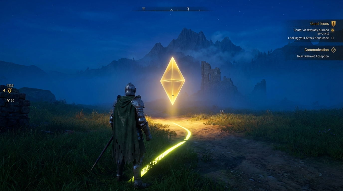
Modern gaming has a bizarre obsession with treating you like a toddler who is about to swallow a handful of pennies. Whether it is a glowing yellow trail leading you to a door five feet away or a pop-up tutorial explaining how to jump ten hours into the campaign, handholding in video games has become the industry favorite security blanket. Designers are so terrified you will encounter a moment of genuine confusion that they have traded the joy of discovery for a GPS-guided tour through a padded cell.
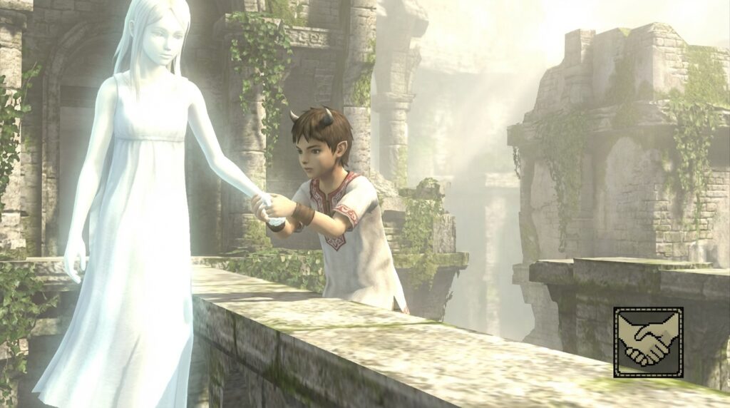
Then there is the literal side of the coin, where characters actually link fingers to navigate a crumbling ruin or share a quiet moment of emotional resonance. It is the ultimate irony. Developers spend millions on mechanics that physically connect characters, yet they use UI clutter to keep the player at arm’s length. We need to figure out when a helping hand is a masterclass in immersion and when it is just a developer admitting they do not trust you to play their game.
Key Takeaways
- Excessive handholding and visual crutches like neon yellow paint insult player intelligence and destroy the satisfaction of organic discovery.
- Modern UI clutter, such as persistent quest markers and GPS lines, replaces environmental engagement with a mindless ‘to-do list’ mentality.
- Effective game design should use lighting, architecture, and subtle environmental cues to guide players naturally rather than relying on intrusive tutorials and prompts.
- Developers must embrace player friction and the possibility of failure, as overcoming challenges is essential for creating memorable gaming experiences.
The Great Yellow Paint Plague
Modern level design has fallen into a trap where developers seemingly believe the average player has the environmental awareness of a goldfish. We have entered the era of the yellow paint plague, a visual crutch where every climbable ledge and breakable crate is coated in neon mustard. It is a condescending design choice that screams at you to look here because the developers are terrified you might actually have to use your brain for five seconds. Instead of a world that feels lived in, we get a series of bright signposts that turn exploration into a guided tour. This trend suggests that the industry no longer trusts us to recognize a ladder unless it looks like it was dipped in a vat of industrial highlighter fluid.
The most frustrating part of this handholding is how it guts the satisfaction of discovery. When every interactive object is color coded for your convenience, you are not playing a game so much as you are following a trail of breadcrumbs left by a panicked project manager. It creates a jarring disconnect where a gritty, realistic forest is suddenly interrupted by rocks that look like they belong in a construction zone. Good design should use lighting, composition, and subtle environmental cues to lead the eye naturally rather than relying on literal paint. By treating players like they lack basic spatial reasoning, studios are sacrificing the magic of those “aha!” moments in favor of mindless efficiency.
If a developer builds a world so cluttered and confusing that I cannot find the exit without a neon splash of paint, the solution is better design, not more paint. We have reached a point where the UI is no longer helping us, but is instead replacing the world itself. It feels like being a toddler in a house where every sharp corner is padded and every drawer is locked for our own safety. There is a profound lack of respect for the player’s intelligence when a game refuses to let you fail or even wander off the path for a moment. We deserve games that challenge our perception rather than ones that treat our monitors like a high-visibility safety vest.
Quest Markers and the Death of Exploration

Modern open world games have developed a pathological fear that you might actually look at the scenery instead of a floating neon arrow. We are currently living through an epidemic where developers treat every ledge and handhold like a crime scene that needs to be cordoned off. It is a bizarre design choice that assumes the average player possesses the cognitive function of a goldfish in a blender. Instead of learning the geography or recognizing landmarks, we spend forty hours staring at a mini-map like a delivery driver lost in a parking garage. This constant UI pestering turns what should be a grand odyssey into a mindless grocery store trip where you are just checking off boxes.
The thrill of discovery is effectively dead when every secret is broadcast with a glowing waypoint three miles before you arrive. There is no sense of accomplishment in finding a hidden cave if the game has been screaming its exact coordinates at you since you finished the tutorial. We have traded the organic joy of exploration for the digital equivalent of a parent holding their toddler’s hand through a padded playground. When the screen is cluttered with quest markers and persistent prompts, the artistry of the world becomes nothing more than background noise. You stop engaging with the environment because the game refuses to let you fail, think, or even wander off the path for five seconds.
True immersion requires a level of trust between the creator and the player that seems to be evaporating in the triple-A space. When a game respects your intelligence, it allows you to use your eyes to navigate based on the lighting, architecture, and natural flow of the terrain. Instead, we get intrusive pop-ups and GPS lines that treat every puzzle like an insult to our basic problem-solving skills. If I wanted to follow a line on the ground for twelve hours, I would have stayed in the checkout lane at the supermarket. Developers need to realize that getting a little bit lost is often the most memorable part of a journey, provided they stop treating us like we are incapable of finding our own way.
When Intuitive Design Beats Constant Nagging
Modern AAA game design has developed a bizarre obsession with treating players like they have the navigational instincts of a confused pigeon. We have all seen it by now. The neon yellow paint smeared over every climbable ledge and the protagonist who starts whispering the solution to a puzzle before you have even finished looking at the room. It is a condescending trend that assumes if a player is not constantly stimulated by a waypoint or a flashing prompt, they will immediately suffer a breakdown and uninstall the game. This type of design does not just kill immersion, it actively robs the player of the satisfaction that comes from actually using their brain to overcome a challenge.
In contrast, the best games trust the player to be an observant human being who understands how a door works without a hovering icon. Intuitive design uses lighting, architecture, and subtle environmental cues to guide your eyes naturally toward the objective. When a developer builds a world that makes logical sense, they do not need to clutter the screen with UI garbage that looks like a GPS for a toddler. There is a profound difference between being guided by a master level designer and being dragged along by a developer who thinks you are too stupid to find a ladder in a well-lit room.
The irony is that this constant handholding actually makes games more forgettable because it removes the friction that creates memorable experiences. You do not remember the time you followed a glowing breadcrumb trail to a chest, but you definitely remember the time you spotted a hidden path because the wind was blowing the grass in a specific direction. We need to stop rewarding developers who treat us like we are incapable of basic spatial reasoning. If a game requires a pop-up window to explain that a red barrel might explode, the problem is not the player. It is a failure of creative vision that values handholding over genuine engagement.
Stop Painting the Ledges Yellow
It is time for developers to stop treating players like toddlers who might accidentally swallow a Lego if left unsupervised for five seconds. We do not need every ledge slathered in neon yellow paint or a protagonist who mutters the solution to a puzzle before we have even finished looking at the room. This obsessive need to eliminate friction has turned potentially great adventures into bloated open worlds where the stakes are nonexistent. When you remove the possibility of getting lost or failing, you also remove the genuine satisfaction of finding the way forward. Trust us to use our brains, because the constant hovering is not helpful. It is just patronizing.
Failure is not a flaw in game design. It is actually the most effective teacher a player can have. When a game refuses to let us stumble, it robs us of that “aha!” moment that makes the medium so special in the first place. We want to earn our victories rather than having them handed to us on a silver platter with a waypoint marker attached. If a player gets stuck, let them be stuck for a minute while they figure out the mechanics you spent years building. The most memorable experiences in gaming come from overcoming obstacles, not from following a trail of digital breadcrumbs or facing off against hardest Souls-like bosses that demand perfection.
The industry needs to finally let go of our hands and accept that a little confusion is actually a good thing for immersion. Stop designing for the lowest common denominator and start building worlds that respect the intelligence of the person holding the controller. We are perfectly capable of navigating a forest without a glowing dotted line or a UI that covers half the screen with helpful hints. If your game is well designed, the environment will speak for itself without needing a loud tutorial pop-up every three steps. It is time to let us play the game instead of just watching it play itself for us.


