Video game accessibility reviews answer the question marketing pages dodge: can people with different disabilities actually play the game, or did someone tick a few boxes and declare victory? Subtitles, colorblind modes, remappable controls, and adjustable difficulty mean little if they’re buried in menus, poorly designed, or fall apart when the action gets hectic. With 21% of adult U.S. players reporting a disability, accessibility isn’t a niche bonus. It’s basic quality control.
I look beyond the feature checklist and test whether these tools remove real barriers for players with motor, visual, auditory, or cognitive disabilities. The best reviews praise smart design, call out lazy implementation, and tell you who can play comfortably before you spend money on a game that treats “hold both triggers” like a reasonable human request.
Key Takeaways
- Accessibility must be evaluated during real gameplay—not by counting options in a settings menu. Test controls, subtitles, visual aids, audio cues, and difficulty tools across combat, menus, traversal, cutscenes, and multiplayer to confirm they remove meaningful barriers.
- Motor accessibility depends on genuinely flexible controls, including comprehensive remapping, hold-versus-toggle options, adjustable sensitivity and dead zones, reduced vibration, and support for one-handed play. These settings must remain consistent during quick-time events, boss fights, menus, and camera control.
- Subtitles, colorblind modes, screen readers, and visual or audio indicators are useful only when they make critical information clear under pressure. Reviews should assess text size and contrast, speaker labels, sound cues, gameplay navigation, and whether visual settings work beyond a single menu or health bar.
- Difficulty and cognitive tools should reduce timing, repetition, navigation, and information-overload barriers without treating assistance as a cheat. Reviews should identify who benefits, explain remaining roadblocks, and give practical advice on what to enable, adjust, avoid, or wait for before buying.
Testing Controls Beyond The Checkbox
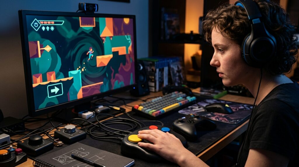
Video game accessibility reviews should test controls during actual gameplay, not admire them from the options menu like a participation trophy. I remap buttons, try different controllers, and check whether one-handed play is genuinely possible or merely advertised with the confidence of a politician unveiling a pothole. A control scheme earns praise when essential actions can move without breaking menus, quick-time events, or camera control. If remapping works for only two buttons while sprinting, aiming, and dodging remain welded in place, that is not flexibility. It’s decorative plumbing.
Hold-versus-toggle options can decide whether a long session feels manageable or like an unpaid hand workout. I test sprinting, crouching, aiming, and repeated button presses with both settings, because a toggle that prevents fatigue is far more useful than another shiny accessibility badge. Stick sensitivity also needs practical testing, including camera acceleration, dead zones, and whether a small movement sends the view spinning into low orbit. Vibration should offer separate intensity controls and a way to disable specific effects. A motor-friendly control scheme should not punish players with hand pain every time a door closes dramatically.
The best reviews explain who these tools help and where they still fall short, rather than declaring a game accessible because it includes a generous-looking menu. I look for consistent controls across combat, menus, driving, platforming, and cutscenes, because accessibility that vanishes during a boss fight is about as useful as an umbrella made of toast. I also note whether subtitles, visual options, and difficulty tools support the same players, since control barriers rarely travel alone. That level of reporting gives disabled players practical information before they buy, and it separates genuinely thoughtful design from a checklist wearing a tiny developer badge.
Auditing Subtitles Visuals And Audio
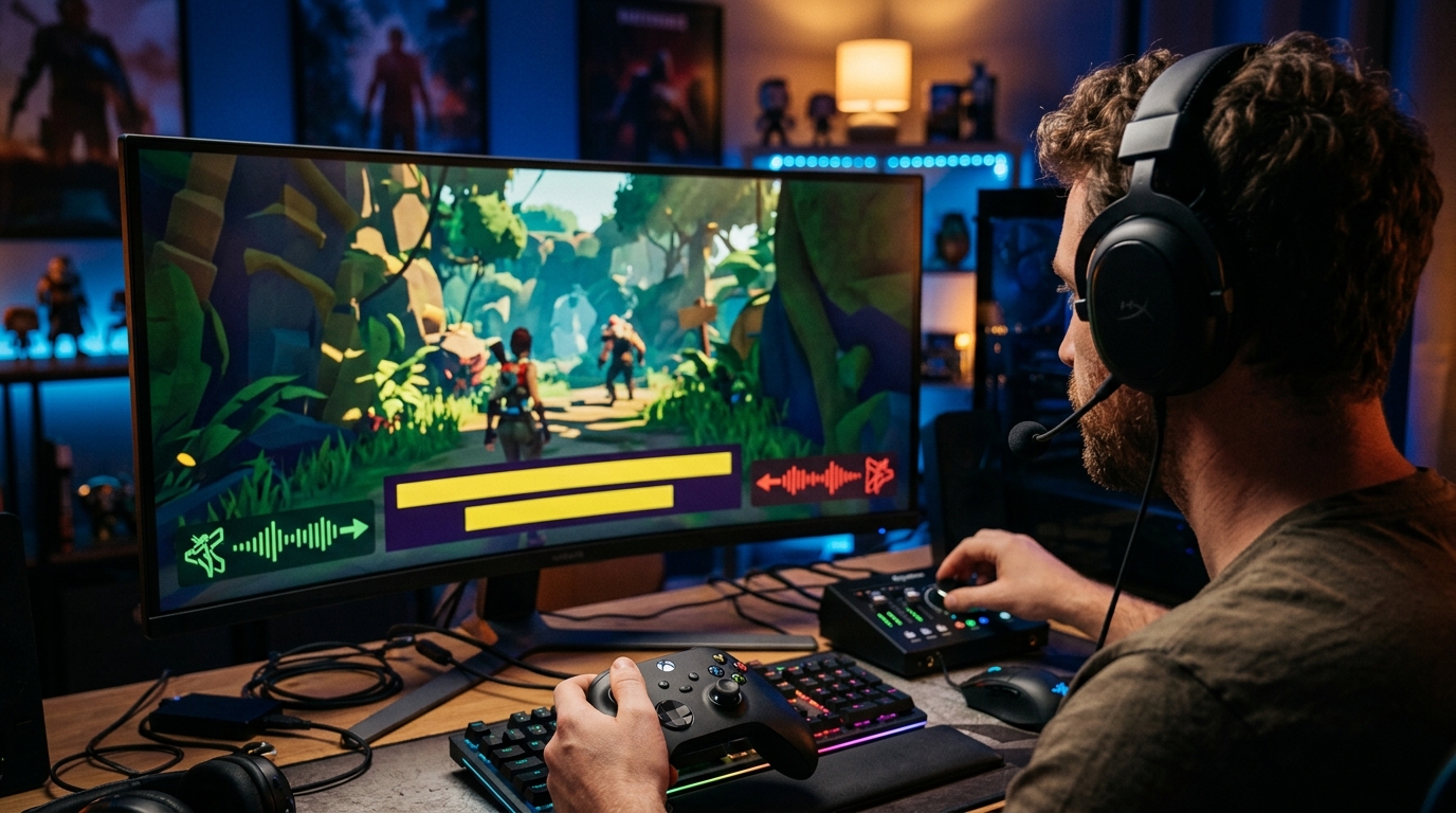
I treat subtitle quality as a usability test, not a checkbox hunt. I check whether text is large enough to read during combat, contrasts with the background, identifies speakers, and stays visible when the screen becomes a fireworks display of particles. Background opacity and text scaling matter too, because “just squint harder” is not an accessibility strategy. A subtitle option that technically exists but turns dialogue into gray confetti is about as useful as invisible ink. I also note whether important sound information, such as enemy attacks or off-screen warnings, gets a clear visual indicator.
Visual settings need the same skeptical treatment. A colorblind mode should help distinguish gameplay-critical information, not slap a filter over the screen and call it a day. I test menus, maps, objectives, and combat effects because a mode that fixes one health bar while leaving every objective marker indistinguishable has clearly left the tutorial early. Screen-reader support gets checked across menus, tutorials, inventory screens, and live gameplay, since reading one settings page aloud is not the same as making a game navigable. Audio cues also deserve scrutiny, especially when the game expects players to react to sounds without offering captions, directional indicators, or any other useful backup.
My video game accessibility reviews separate genuinely helpful tools from features included mainly to decorate a settings menu. I explain what each option changes, where it works, and where it falls apart, rather than tossing readers a cheerful list of checkboxes. A game can have extensive text controls and still bury vital information in tiny, low-contrast labels, while a simpler interface can make every warning immediately clear. That distinction helps players find games suited to their needs and gives developers a reason to fix lazy design. Accessibility is not bonus polish, and I will not review it like one.
Measuring Difficulty And Cognitive Load
In my video game accessibility reviews, difficulty is not a morality test disguised as a menu option. I check whether adjustable difficulty, combat assists, aim support, and reduced enemy aggression actually create control, or merely slap a “Story Mode” label on the same frustration. Good settings widen reaction windows, soften punishment, and let players learn without being repeatedly fed to the boss like a particularly unlucky snack. Bad settings change damage numbers while leaving frantic timing, cluttered arenas, or mandatory precision untouched. The difference matters for players who need a slower pace, steadier controls, or fewer repeated failures.
Navigation tools and puzzle skips are equally important because getting lost is not the same thing as enjoying exploration. I look for clear objectives, readable maps, waypoint options, hint systems, and skips that respect the player instead of treating assistance like a shameful cheat code. Save systems also deserve scrutiny, especially generous checkpoints, manual saves, suspend options, and whether a failed attempt forces players to replay ten minutes of dialogue. These features reduce memory and repetition demands, which is excellent news for anyone whose brain does not keep every corridor, clue, and enemy pattern filed in a perfectly labeled cabinet.
The final test is information overload, because a screen packed with icons, prompts, damage numbers, quest logs, and particle effects can turn a game into an unpaid office job. I assess whether players can hide unnecessary markers, pause during tutorials, review objectives, and control how much information arrives at once. Timing changes, simplified inputs, and repeatable tutorials can make a demanding mechanic manageable without removing its identity. Strong accessibility reviews explain who benefits from each option and where the game still falls short, rather than awarding a gold star because subtitles exist. That is the useful part of the job: separating genuine flexibility from decorative checkbox nonsense.
Writing Reviews Players Can Use
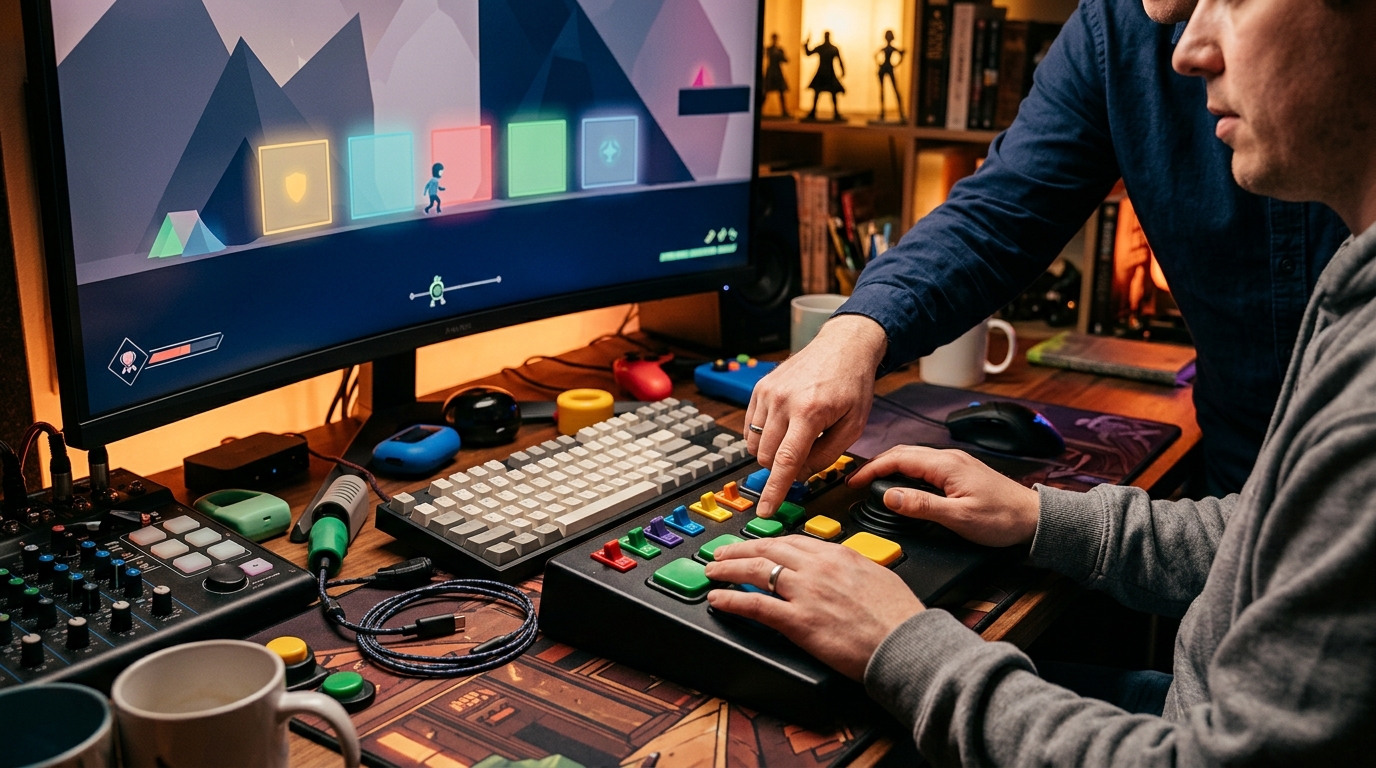
A useful video game accessibility review starts with the player, not a checkbox parade. I explain who benefits from each option, whether it helps players with motor, visual, auditory, or cognitive barriers, and what it cannot fix. Remappable controls sound great until one essential command refuses to move, while subtitles are not much use if they omit speaker names, sound cues, or dialogue during frantic combat. I test features in menus, cutscenes, traversal, boss fights, and multiplayer, because accessibility that vanishes after the tutorial is just a demo wearing a tiny hat.
Every review should end with practical advice rather than a vague thumbs-up and a cloud of corporate fog. I separate what to enable immediately, what to adjust for a specific play style, and which roadblocks may make the game a bad fit from the start. That means calling out tiny text, flashing effects, forced button mashing, unclear audio cues, unskippable sequences, and difficulty tools that quietly stop working halfway through. The result tells readers whether to play, tweak, wait for a patch, or uninstall before the first accessibility wall turns their evening into unpaid quality assurance.
I Test Accessibility Beyond the Menu
Strong video game accessibility reviews should test outcomes, not simply count menu options. A game can advertise remappable controls, subtitles, colorblind settings, and difficulty tools, then still bury crucial prompts in tiny text or demand split-second button presses. I want to know whether those features actually remove barriers during play, not whether the settings screen looks busy enough to earn a gold star. If a control scheme reduces strain, subtitles clearly identify speakers, or visual options make hazards readable, the review should explain how and why.
That means reviewers need to report specific problems honestly, including where they appear and who they may affect. Can players finish a combat sequence without rapid button mashing, adjust subtitle size without losing important information, or distinguish enemies without relying on color alone? A vague “good accessibility” label tells readers almost nothing, while concrete examples help players match a game to their needs before spending full price on an expensive lesson in frustration. Accessibility coverage deserves the same care that critics already give graphics, performance, and frame rates, because a beautiful game that cannot be played is still a very polished doorstop.
The best accessibility reviews also recognize progress without handing out medals for basic competence. Developers deserve credit when an update adds meaningful control, visual, auditory, or cognitive support, but promises and option counts should never replace testing. I would rather read an honest review that identifies three serious barriers than a cheerful checklist that pretends every player has the same hands, eyes, ears, and patience. Better reporting helps players find games that respect their needs and pushes the industry toward accessibility that works in the real world, where menus cannot defeat the final boss for us.